To be a professional graphic designer in the logotype, you must follow five golden guidelines.
Rule 1: Don't Do This
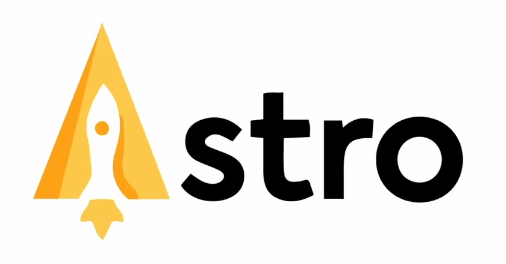
The first golden rule is replacing a letter in the logotype with a suitable symbol or image, which many inexperienced designers prefer doing. But wait, can it be that bad?
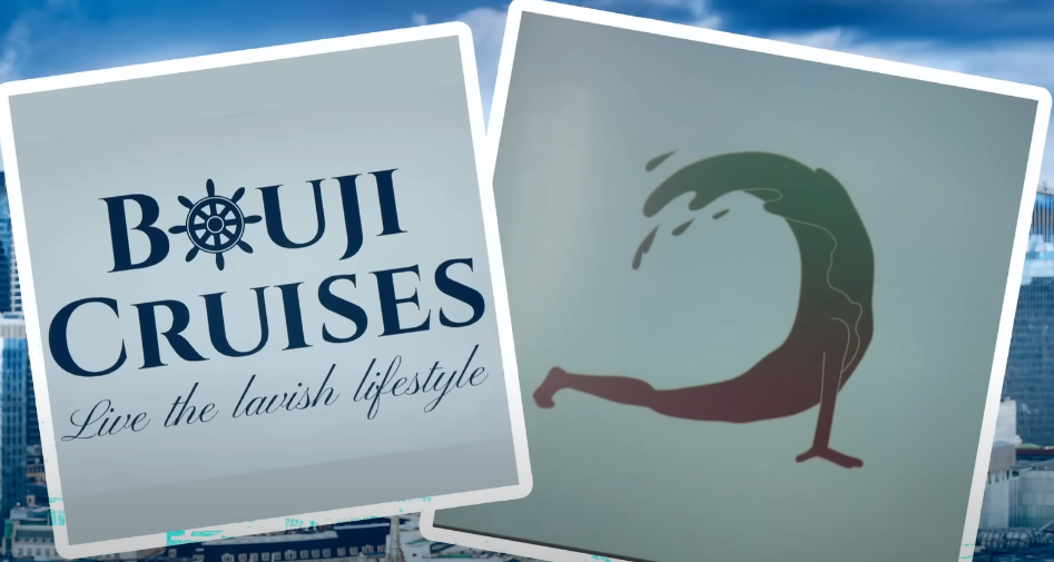
For example, we'll look at a popular British television program where aspiring marketers and businesspeople battle to be the sole working partner of a well-known tycoon.
In one episode, the contestants were divided into two groups, each of which had to produce a branding identity and logo solution for a baby food company. One of the logos presented in the episode is shown below.
.png)
Parents want their babies to be alive after they feed them their food, so it doesn't inspire the best confidence in a product intended for babies. Nevertheless, this only happened once on the show; it occurred numerous times—another example we find here with the cruise ship experience and logo design.
The point is that many inexperienced logo designers immediately think of changing a letter in the logotype with a symbol or image, but this should be entirely skipped.
The Remedy
To avoid confusing people that engage with your logo, strive to discover a new design direction. Even if 8 out of 10 individuals will read Astro, others will just read stro, which causes uncertainty for the brand.
Rule 2: Marketing Is Crucial
The second golden rule is the most interesting one in today's article. It would be like eating cereal without milk if we left it off today's list.
Your logotype must assist in reaching the appropriate audience with the brand's message. We can't overstate how crucial it is to have a fundamental grasp of marketing when you start in the logo design industry, and here's why.
Real Case Example
Honda has a competitive pricing advantage while having market influence thanks to the quality of its engines and construction.

Significantly, the study indicates that the middle-class segments are Honda's target market. The thing about middle-class people in society is that they experience luxury in its most basic forms and hence have a small slice of it.
They are financially secure but want to look more successful to their friends, family, and society. The middle-class population frequently wants access to the luxuries those in higher income brackets enjoy. This group of people highly desires something that will boost their social standing or recognize the amount of time and effort they have put into their jobs.
You can understand why they choose an uppercase serif font when looking at the logotype for the Honda brand. The capital letter shapes and serif font help Honda appeal to the middle-class market by giving them the impression that the brand is somewhat extravagant and produces high-quality goods. Serif fonts also often convey quality as superior and high status.
Simple & Powerful Teaching
When we discussed the Honda target market, we explained what they want and how getting it would affect how they feel or how others will see them. You should consider This marketing strategy when selecting the logotype for your logos.
Take note of the Honda slogan, "The power of dreams," as well. Incredibly wealthy people who have been for so long don't want luxury or fortune since they already have it. Many individuals in the middle-income brackets will be daydreaming about it.
Rule 3: Scaleable
The following golden rule for logotype is to make sure your logotype is readable at all scales. You want the brand name to be shown only where it can be read, such as on company letterhead. To test whether your logo is still readable at a distance, one is advised to take steps four to six feet from the monitor. Also, you should try printing your logo in various scales and sizes on paper to see how it looks and operates.
The Remedy
It's customary to provide the customer with two copies of every logo variant you create, one with the kerning packed tightly for larger-scale usability and the other with broader set kerning for smaller-scale designs.
Rule 4: Don't Auto-Kern (Major Logo Mistake )
Speaking of kerning, have a look at this redesign for the English clothing company Zara, this gets us to the fourth golden rule.
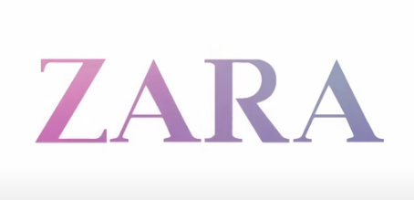
ZARA logo 2008 - 2019.
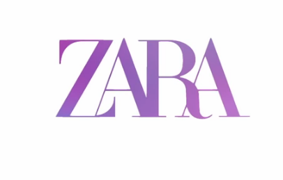
ZARA Logo After Redesign 2019 - Present.
Avoid using automatic kerning in your designs. By default, programs like Adobe Illustrator have different tracking settings, which are generally fine, except for body text. However, when designing something obvious to everyone who sees it as the logotype, you must manually kern things.
The Eye Trick & More
It's preferable to slightly blur the design in your eyes so that you can more readily detect any gaps in your logotype or other issues. Additionally, consider kerning your logotype in sets of three characters, then combining everything at the end. Another tactic is to turn the logotype upside down so that you don't have presumptions about the letterforms; instead, the letters become workable shapes.
Rule 5: Font Pairing
The fifth golden rule is the inability to combine typefaces on a logo appropriately. The primary logotype is the most recognizable element of the typography, and the secondary typography further explains to the audience what the business does. Both must work harmoniously since each has a crucial role in telling the brand's story. Honda's slogan is in title case, much smaller, and discreet, while the brand name is authoritarian in bold, huge, and uppercase.
Taglines Talk
The main logotype introduced itself impressively, and the tagline seems like it's being told to you by a person directly. When pairing logotypes, it's best to stick with serif and sans-serif fonts, as seen on the Honda logo, and avoid using two ornate or intricate typefaces. You may also experiment with bold and thin fonts, frequently yield pleasing results.
Rule 6: The Dreaded 'T' Word
The sixth and last golden rule is to avoid the t-word or trends. Avoid using trendy typefaces or favorite fonts that represent the moment when creating logos. Consider the hypothetical soap brand Lavender.
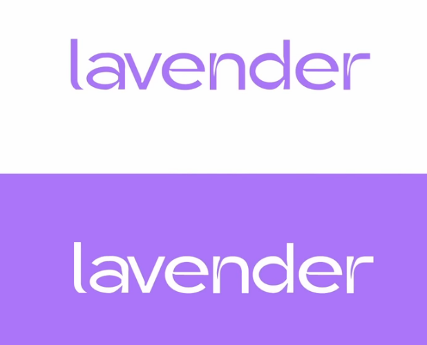
Based on the brand's brief, brand message, and target market, the logotype may be effective; however, if the designer selected this font merely because it is trendy at the moment, likely, the brand will not effectively reach its target market.
As with graphic design in general or in any area of life, there are trends in typography and logotype that come and go, so avoid following them and make sure your logotype doesn't depend on a trend to be successful. There you have it, the six golden rules of logotype creation. Until then, construct your future now.
Reference:
Satori Graphics
6 GOLDEN Rules Of Logo Design (Logotype) — 100% Essential!
Images were used in the article from Satori Graphics video on logotype golden rules.